- A SMALL SAMPLING OF PAST PROJECTS -
Client Portfolio
Marcia Hardy,
Hardy Realty LLC
Marcia approached me ready for a full website refresh. She wanted something that would, in her words, “bring her website into this century” and reflect the experience and expertise she has built in the Real Estate industry.
I designed her a brand new website on Squarespace, along with selecting new brand fonts and a color palette.
-
Marcia wanted to showcase her business in a more modern way, but without losing its approachable, welcoming feel. I designed her site to reflect her warm nature and years of expertise in the industry.
-
Marica loves the Pacific Northwest and wanted to pull colors from her passion for gardening and spending time in the outdoors in the area. I created a new color palette for her that would still mesh with some of her past branding, but have a more modern and refreshed feel.
-
To view Marcia’s full site, you can visit hardyrealtyllc.com. Please keep in mind that clients may have made changes to their site since the initial design.
Alison Scott,
Health Coach
Alison came to me as a brand new entrepreneur looking to get her health coaching business represented online. She wanted to create a warm and welcoming environment that would appeal to middle-aged women looking to lose weight and increase their sense of well being.
-
Alison lives near and loves the California beaches, and wanted that light and airy feeling reflected in her website. She also wanted fonts that are easy to read (no script) and simple, straightforward messaging so that potential clients could get a grasp for her services right off the bat.
-
We chose colors that represented Alison’s love of the coastal lifestyle, including light blues and sandy hues.
-
To view Alison’s full site, you can visit alisonmscott.com. Please keep in mind that clients may have made changes to their site since the initial design.
- IN HER WORDS -
“I LOVE MY WEBSITE!! It’s totally me, I can’t believe it’s done. It really gives me a sense on confidence. I’ve been doing my work but this makes me feel legit. Thank you so much, you really brought it to the next level. Wow!”
Alison Scott, Health Coach
Simple Health Transformations
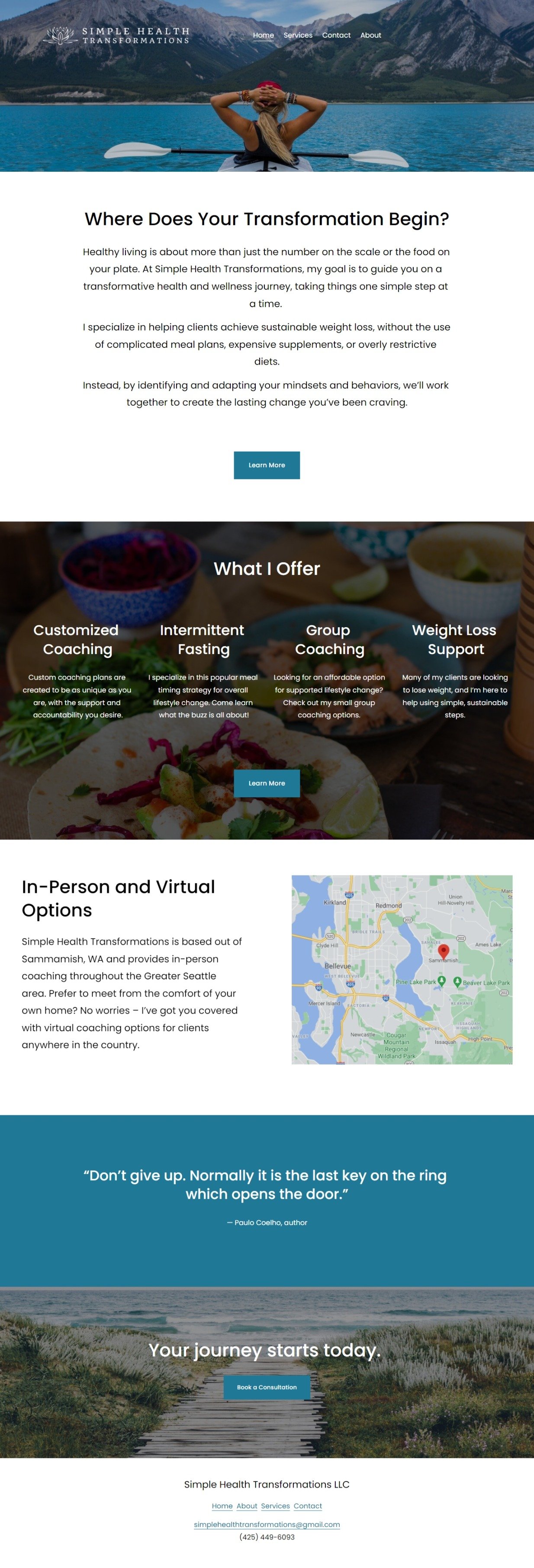
Beth had just finished coaching school when she came to me ready to represent herself online as a brand new wellness coach. Her vision was to have a straightforward website that really got to the point of what she offers and reflected her business model of “simple” transformations. I designed a logo, business card, and new website for her to reflect this approach.
-
As mentioned, Beth wanted a simple site that wasn’t flashy or cost prohibitive. She also wanted the photos on the site to reflect her love of nature and being outdoors. I designed her logo using a lotus flower to represent the transformational journey she takes clients on, and the nature inspired elements she loves.
-
I choose calm, cool colors and crisp photography for the site to fit Beth’s vision of it being simple and sophisticated.
-
To view Beth’s full site, you can visit simplehealthtransformations.com. Please keep in mind that clients may have made changes to their site since the initial design.


